Emphasis, Ambiguity and the Unintended

Computer-aided Misrepresentation in the Design Process

Representation is central and integral to the design process. A design only exists as a representation until a project is executed, and thus its proper representation is essential to all perceptions, judgments and evaluations made and required until that day. Any design representation must reflect and correspond to the state of proposed, pending, and as-yet-unaddressed design decisions at a given time.

The visible representation of design proposals is limited to some form of two-dimensional, orthogonal projection, or three-dimensional model, isometric, or perspective view. Each of these representations can be accomplished ‘by hand’ or with the aid of various technologies, most usually computer software.

Representations are created to evaluate proposals appropriate to the aspects of the design problem under consideration. The prioritization of effort in the representation should closely correspond to the state of the design. Representation of still-undefined elements should be left ambiguous or unstated. Irrelevant or self-evident elements, when included, should be represented in a manner that makes their stature clear.

Terminus
Study for terminus of the public green in a new town center.

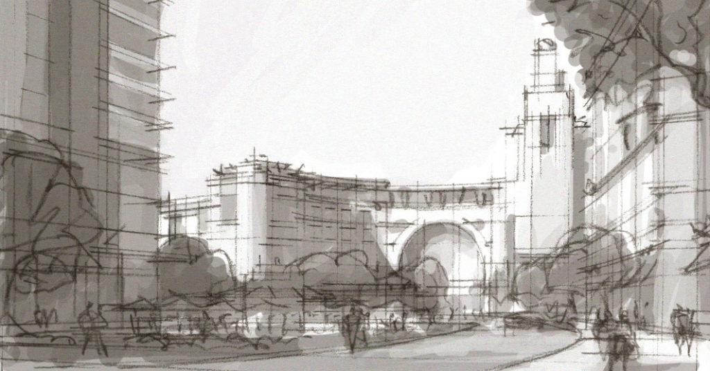
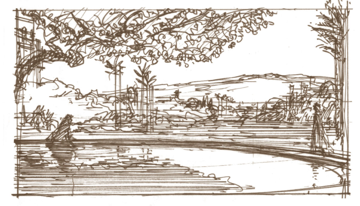
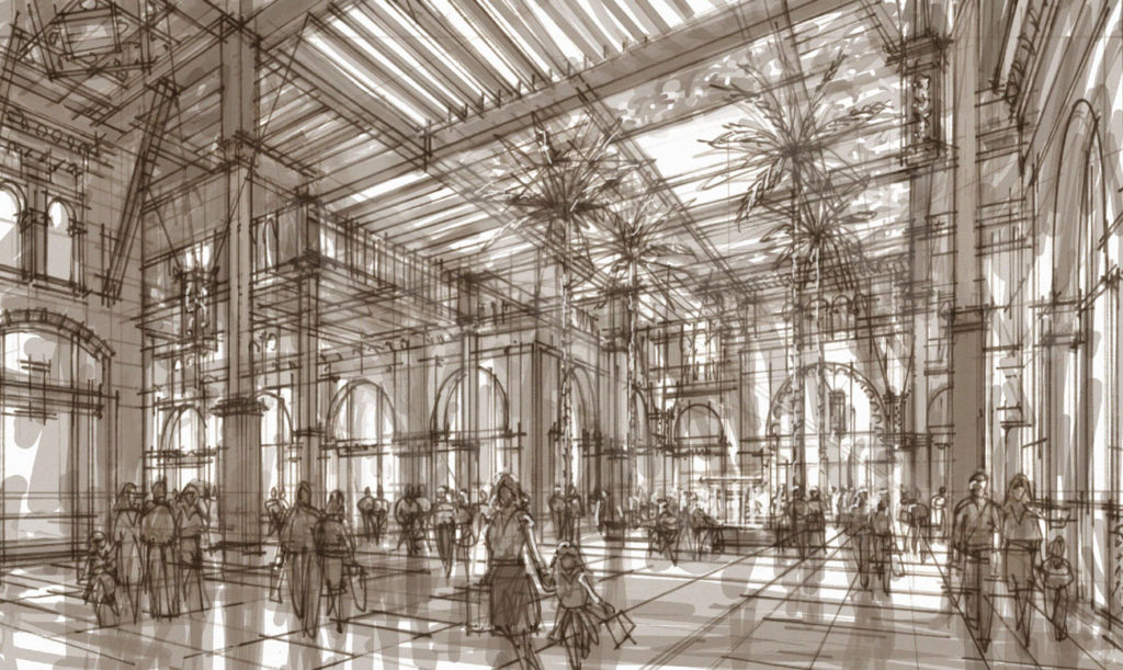
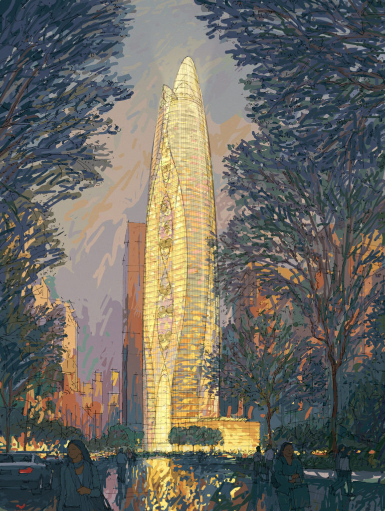
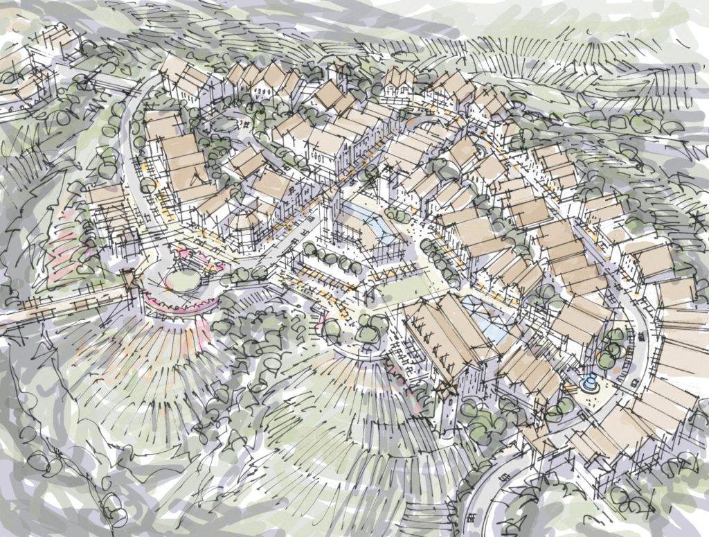
In traditional design representation, most usually by-hand drawing, the actual physical effort and time allotted to the exploration, development, and depiction of any particular element is—by the nature of the medium—generally proportional to the importance of that element in the current design proposal. In other words, a designer will not spend great effort drawing entourage at the expense of project-related solutions or alternatives. Entourage may be included for purposes of communicating scale or space, but it is a misapplication of effort to embellish it beyond that function. Similarly, detailed, extensive rendering of materials is rarely necessary to thoroughly communicate their character and contribution to the design. The hand-drawing medium itself encourages a well-prioritized effort that inherently focuses on what the designer seeks to emphasize in the particular study at hand.

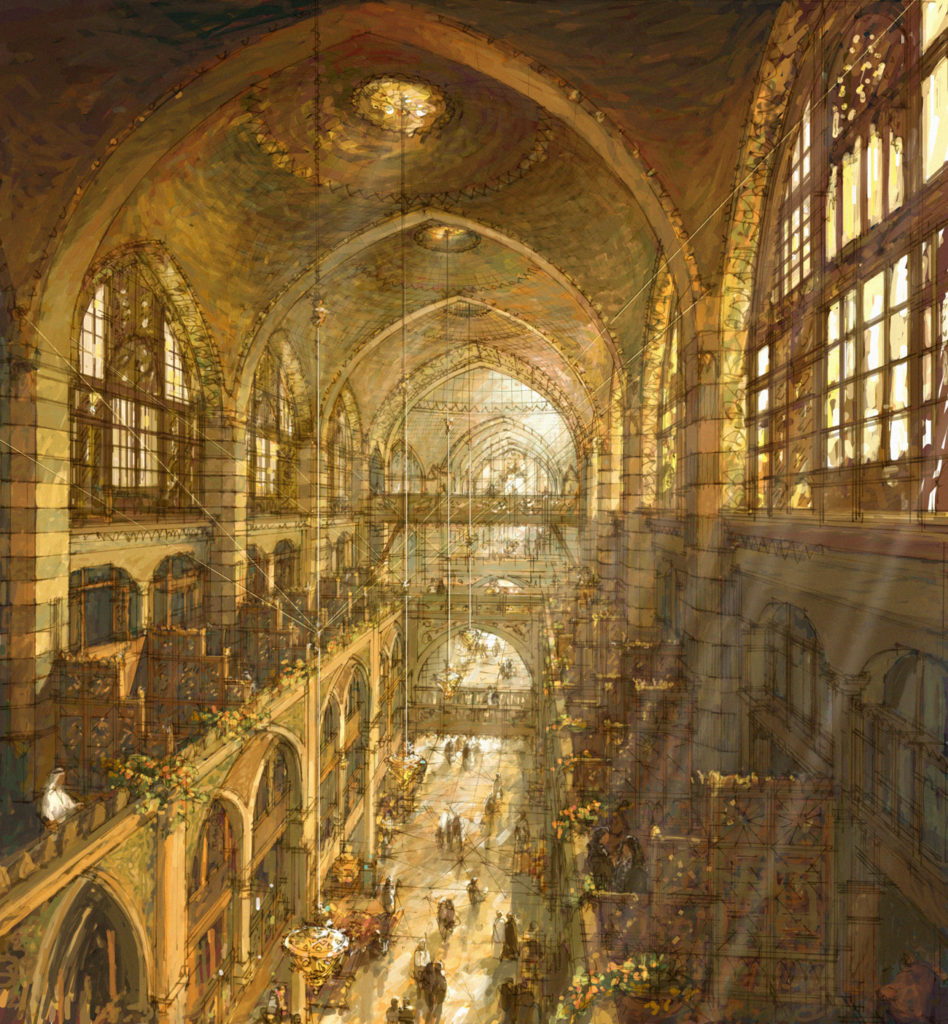
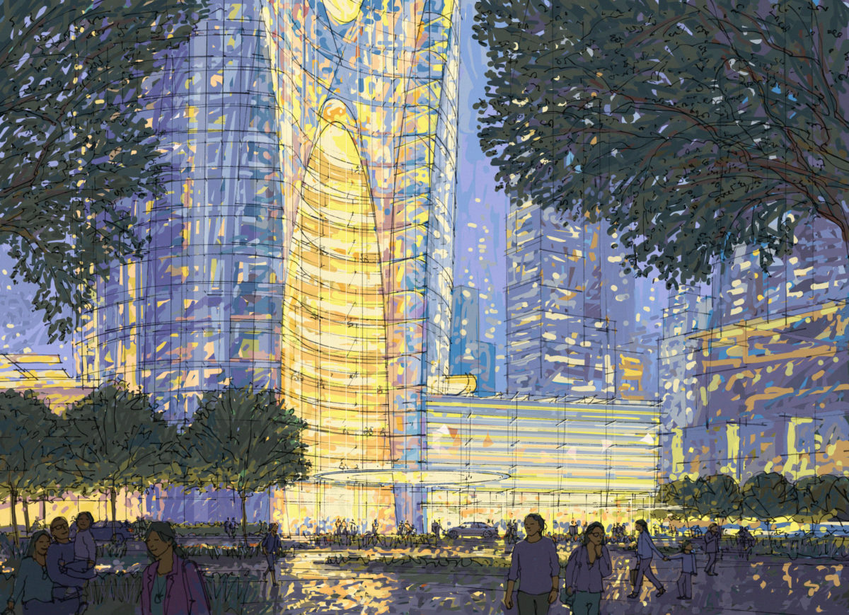
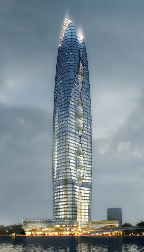
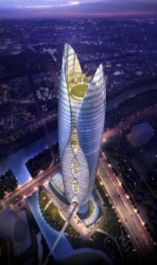
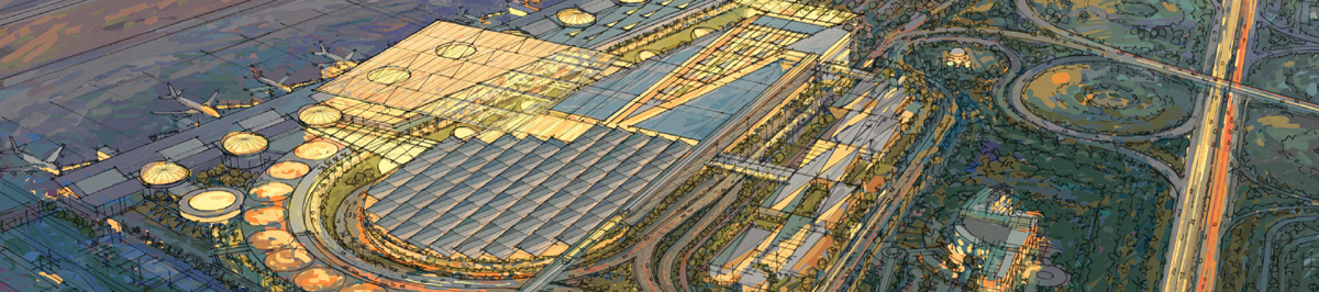
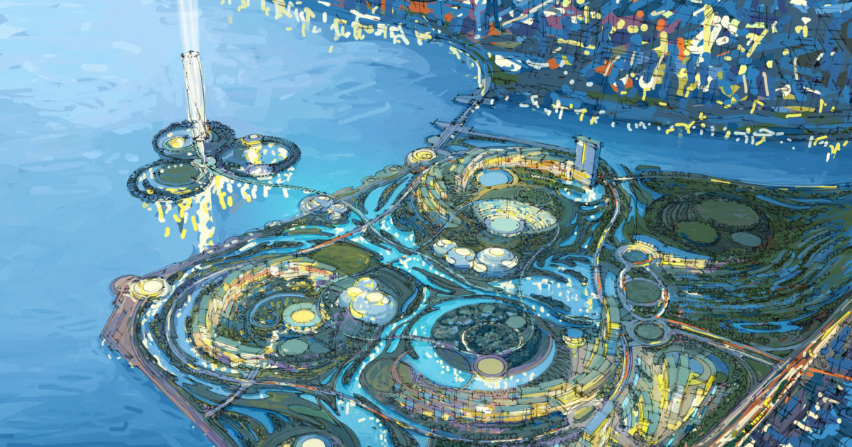
In contrast, this same proportioning and prioritization of effort and focus is easily distorted when a designer utilizes software-driven means to depict a design solution. It is little trouble to include fully detailed automobiles, photorealistic people and trees, and highly-rendered materials in a computer-generated depiction. Through this aspect alone, the design questions being posed by a given proposal often lack proper focus and relative emphasis. The skewed prioritization creates a misrepresentation, compromising the designer’s, and the client’s, ability to properly evaluate the proposal. The ability to evaluate a particular aspect of a design at its proper time in the process is compromised and even eclipsed by the presence of design decisions whose time has not yet come. What should one focus on if everything is apparently of equal importance? How ‘proposed, evaluated, and accepted’ is any one aspect of the design when everything is represented as such?

At any point in the design process, there are many elements that have not yet been fully defined. Nevertheless, they form much of the context in which the current design questions are framed. It is important to represent such aspects in an ambiguous fashion so that one may properly judge current proposals ‑ not allowing their specifics to distract us from the issues under discussion, or to imply that they are fully intended as shown. It is difficult to generate vague or ambiguous context via the computer, and even when done effectively, it often requires disproportionate effort simply to do so.

Study for layout of hilltop town center surrounded by vineyards.

Beyond posing challenges to proper design evaluation, the assignment to the computer of many ‘rendering’ tasks—especially those related to spatial structure, light, and shadow—undermine the development of clear understanding in those same realms by the designer. Designers may become adept at the operation of the software at the expense of their own knowledge regarding the fundamental building blocks of design.

Of course we cannot accept designers who are less than competent in the use of their communication media, whatever it may be. Lucid evaluation of design proposals by the client, and by the designers themselves, is crucial to the development of good design solutions, and cannot occur without appropriately accurate and transparent communication media. This applies to by-hand as well as computer-aided means. Nevertheless, correspondence between effort and importance is inherently balanced in a by-hand design drawing process, but prone to significant distortion when aided by the computer. A good design drawing lets one clearly see what is intended, imagine what is implied and ignore what is off-topic. By contrast, nearly all program-based representations ignore emphasis, imply intent where there is none, and draw attention to the irrelevant.

Poets' museum at the intersection of river and canal.
Study of linear canal flanking multiple civic districts and nodes.

Capable designers understand these tendencies and, rather than accept them, develop processes that capitalize on the strengths of each medium while avoiding the pitfalls that undermine a proper design process.

—MSL

The Seductive Drawing

Where Does Design Intent Lie?

In the fall of 2016, I went to Boston to view Steve Oles’ retrospective at the Boston Society of Architects. The show, ‘Truth in Architecture,’ was timed to coincide with both Steve’s 80th birthday, and the annual conference of the American Society of Architectural Illustrators. The keynote speaker at the ASAI conference was Moshe Safdie, recipient of the 2015 AIA Gold Medal. Mr. Safdie is a major client of Neoscape, a digital illustration house that graciously hosted the conference. Mr. Safdie tailored his talk well for the audience, discussing the representation of design, both by hand, and utilizing the computer, wherein Neoscape excels.

What caught my ear was Mr. Safdie’s recounting one of the more pernicious fables in design – that drawings are too often ‘seductive,’ misleading us into thinking a design is better than it actually is. He followed up with me later by email to clarify his position:

‘There are two aspects to the potential seductiveness of any rendering, be it a drawing, computer rendering or a model. One aspect is of seducing the viewer, be it the client or the public. The other, which I was referring to, is of seducing the author himself … being seduced by his facility; that is to make things look so good, because of the natural facility as an artist, that it goes beyond representation and starts giving qualities to a design which actually, as a building, they might not possess. I do think there is some validity to this, and I do think that one of our successes as designers is to develop sharp, critical facilities that we can direct at our own work as it evolves. Most architectural disappointments have to do with the absence of that critical facility by the designer.’

How can we but wholeheartedly agree with Mr. Safdie’s statement? The issue, of course, is how on earth to develop these ‘critical facilities.’ Is it by purposefully avoiding the development of drawing abilities? Of course not. Yet the specter of the seductive drawing persists, collaterally creating certain suspicions regarding those skilled in representation. There is an implication that development of that skill has taken priority over, or even displaced, the development of one’s ability to design, and to critically evaluate design. Mr. Safdie even hints that there might be something inherently different about this person, someone born with a ‘natural facility as an artist.’

Customs House Dubai
Gallery of the Customs House Hotel, Dubai.

This is not to say that the ability to represent a design alone is all that is required to design well. Yet without it, how does one propose and evaluate designs? Design is ultimately the proposal of a specific physical solution to a problem. It may have any number of abstract, intellectual components, but even those cannot be evaluated in the actual design solution without credible, visible representation via a drawing or model.

The concern over seduction by one’s own drawing / representation infers that the skilled draftsman routinely runs the risk of creating a monster, one so devious it can lead its creator astray from his or her own intentions. The seduction Mr. Safdie refers to besets the designer who is captivated by their own ability to draw. How does one overcome such an infatuation?

The first and most prevalent choice appears to be simply to not acquire drawing abilities in the first place(!) But we can see how forsaking a tool as valuable as drawing can seriously compromise a designer’s ability to self-communicate, and thus to self-evaluate. The second choice is to develop the skill to such an extent that it becomes a fluent, transparent process one sees through, to the design, rather than looks at for its own sake. This should be any designer’s goal – to command the tools of the process rather than to mistrust, fear, or be manipulated by them.

Wai Kai Duke's
Duke’s restaurant as sunset fades to night.

No doubt we have all witnessed the examples of the seduction of computer users by their programs. The challenge there is the same—or even greater—a dense topic for further discussion.

The other erroneous implication in the fable of seduction is that it is the drawing that has let us down. Mr. Safdie says that most architectural disappointments have to do with the lack of designers’ critical facilities. Yet we can only be disappointed in relationship to expectations, and those expectations are set by the representation of the design. If the only representation is some designer telling us “It’s gonna be great!” there’s a lot of room for disappointment. But if the intent embodied in a good representation doesn’t make it through to opening day, there are many possible culprits.

We must assume, i.e. require, that the designer does not represent impossible conditions. This is not just a matter of physical or spatial distortion, but also of disallowed (i.e. ‘impossible’) things like program omissions, budget overruns, and zoning or building code non-compliance. Thus a valid representation is one that can indeed be accomplished within the parameters of the design problem. After that, it is a matter of execution. If we want the entry to be grand, or the structure to be lightweight, or the last rays of the sunset to dance across the lobby, and are able to depict what that means, we must then actually make it happen.

Atlas Garden
Shady arrival court (from parking below), Atlas Garden, Marrakech.

Too often we fail in the execution. In part, this is because we do not take the design intent drawing seriously enough. A design drawing is not just a pretty picture, some ‘artist’s impression.’ If the drawing gives desirable qualities to buildings ‘they might not possess,’ why wouldn’t we want the buildings to possess them? Where does the fundamental design intent reside? If we are disappointed, it is because of the failure to meet our expectations, a failure to deliver on the aspirations in that drawing. It is not the drawing’s fault.

—MSL

The Texture-mapped Flythrough

And What it Says About Us

It all looks the same – and yes, it pretty much is. There has been no significant change in ‘state-of-the-art’ computer representation in the last decade or more, except that we have now universally surrendered it to the anonymous renderer and the software toolsmith. As a result, we have collectively processed our message and further quieted our voices. In assigning the task of representation, we have inadvertently surrendered the soul of our profession, and as a consequence, assigned design itself to the group consciousness – photos of people in a texture-mapped world, on a blue sky and green grass mid-day fly-through.

Perhaps it looks the same just because it’s actually more like reality. Yet photo-realism is a surrogate realism, and it is not the only one. It is in no way immune from, and may well be more susceptible to, distortion and misrepresentation. These can occur both through ignorance as well as by conscious manipulation. We all accept the illusion of photo-realism, no matter how accurately it represents design intent or reality.

Is reality levitating through a project at ten miles-per-hour wearing wide-angle goggles? Is not the experience of any engaging environment a prioritized series of well-composed moments, rather than a through-the-windshield view of a passing landscape? Aren’t there most important moments, typical moments, and ones in-between? Being there means being there. Hang on a second, don’t rush me.

Much-better-than-average CAD rendering effort, Shao Xing Tower.

Compare the TMFT to the inspirational visualizations of Wright, Saarinen, Ferris or Goodhue. Their buildings have individual character – but it wasn’t just the format of their delineations that distinguished them. There was an aspiration inherent in the designers’ depictions, a promise that the building was like no other, possessing an individual character that might only become fully known through careful observation and consideration. There is no such aspiration in the TMFT. What you see is what you get, and that’s all there is. Move along, nothing to see here.

A little hand linework and quick color over simple working CAD model.

As we all ‘draw’ the same way with the same media, we are blindly imitating and accepting ‘reality’ as defined by some offshore rendering shop. We’re designing what’s easy to render. Using what works well from the materials editor. What’s easy to build in SketchUp. Or maybe what’s fun to contort in 3D Studio. We are not demanding about representation because we don’t know enough about it to know what to demand. Through our negligence and complicity, the purview of design is increasingly defined and constrained (rather than enhanced or expanded) by the software, its users, and by the toolsmith.

CAD rendered version beginning with same model.
CAD renderer’s version of with same model.

These constraints are inherently biased toward the quantifiable rather than the qualitative. They are not neutral in terms of accommodating individual character or craftsmanship, and perhaps not even humanity. They have no aspirations – other than to be your only means of expression. As the designer becomes detached from the individual and human aspect of the process—the actual craftsmanship of design—he or she has surrendered this privilege and obligation to design to others. Yeah, that looks cool. Use that.

When we embrace such a process, we are admitting that we don’t have anything more to offer. Years ago, we were seduced by the technology, apparently believing ourselves that it could stand in for significant aspects of our own capabilities. This over-zealous embrace has encouraged the forsaking of fundamental capabilities and, through the combination of these actions, we have made ourselves increasingly superfluous.

Eye-level view by hand over simple CAD wireframe.
Eye-level view, linework and color by hand over working CAD wireframe.

We haven’t progressed over the last decade; we have only succeeded in further assigning away design. Why have so many architectural firms been acquired by large contracting and engineering concerns? Only because they still need a few designers to site-adapt an idea or two – and then they’re off. Thanks buddy, we’ll take it from here.

—MSL